You might have come across scenarios where you want to display a tooltip or change some styling of an element when the user hovers over something. In this tutorial, we will learn what are the available functions to handle mouse hover events in React.
Setting up the Project
Let's create a new React project using the following command:
npx create-react-app react-on-hover
Let's add some basic styles to index.css, which will be used in the next steps:
.button {
  background-color: maroon;
  color: white;
  padding: 5px 10px;
  margin: 0 auto;
  display: block;
  cursor: pointer;
}
.outer-box {
  width: 200px;
  height: 200px;
  border: 1px solid blue;
}

.inner-box {
  margin: 50px;
  width: 100px;
  height: 100px;
  border: 1px solid red;
}
.message {
  text-align: center;
}
Changing styles when a button is hovered
Let's add a button and change its color when the user hovers over it:
function App() {
  const handleMouseEnter = e => {
    e.target.style.background = "grey"
  }
  const handleMouseLeave = e => {
    e.target.style.background = "maroon"
  }

  return (
    <div className="App">
      <button
        onMouseEnter={handleMouseEnter}
        onMouseLeave={handleMouseLeave}
        className="button"
      >
        Hover over me
      </button>
    </div>
  )
}

export default App
As you may see, we are using onMouseEnter event to know when the mouse is hovered over the button and to change the color of the button.
Also, we are using onMouseLeave event to identify when the user has hovered out of the button so that we can change the color of the button to the original one.

Displaying a text when the button is hovered
If you want to display a text when the button is hovered, you can do so by introducing a state and by setting it to true when the button is hovered and by setting it to false when the mouse is moved out:
import { useState } from "react"

function App() {
  const [showText, setShowText] = useState(false)
  const handleMouseEnter = e => {
    e.target.style.background = "grey"
    setShowText(true)
  }
  const handleMouseLeave = e => {
    e.target.style.background = "maroon"
    setShowText(false)
  }

  return (
    <div className="App">
      <button
        onMouseEnter={handleMouseEnter}
        onMouseLeave={handleMouseLeave}
        className="button"
      >
        Hover over me
      </button>
      {showText && <p className="message">Now you can see me!</p>}
    </div>
  )
}

export default App
onMouseOver and onMouseOut events
There are a couple of other events which can accomplish the same goal, they are onMouseOver and onMouseOut events. The key difference between these events and the ones we discussed earlier (onMouseEnter and onMouseLeave) is that onMouseOver and onMouseOut propagate (bubbles) up the DOM hierarchy.
For better understanding, let's see the difference with the help of an example:
function App() {
  const hoverHandler = () => {
    console.log("onMouseEnter")
  }
  const outHandler = () => {
    console.log("onMouseLeave")
  }
  return (
    <div className="App">
      <div
        className="outer-box"
        onMouseEnter={hoverHandler}
        onMouseLeave={outHandler}
      >
        <div className="inner-box"></div>
      </div>
    </div>
  )
}

export default App
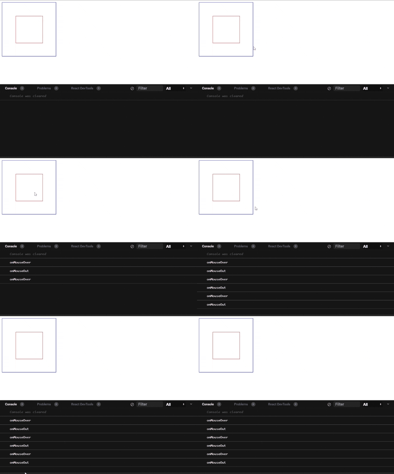
Here we have 2 boxes, one inside the other. As you could see from the below animation, onMouseEnter and onMouseLeave are trigged only once, even though we hover between the parent and child div multiple times.

Let's update the code with onMouseOver and onMouseOut:
function App() {
  const hoverHandler = () => {
    console.log("onMouseEnter")
  }
  const outHandler = () => {
    console.log("onMouseLeave")
  }
  return (
    <div className="App">
      <div
        className="outer-box"
        onMouseOver={hoverHandler}
        onMouseOut={outHandler}
      >
        <div className="inner-box"></div>
      </div>
    </div>
  )
}

export default App
As you could see below, onMouseLeave is triggered as we move from the outer div and onMouseEnter is triggered as we enter the inner div.
The same thing happens when we move out from the child div to the parent one as well.

If there is only 1 element, to which you need to bind the mouse hover events, then you can choose either of the options. If there are multiple items in the hierarchy, you can choose an option based on your need.
