Unlike checkboxes, radio buttons always come in groups. Let it be selecting your gender or choosing the size of the Pizza. In this article, we will see how to render radio buttons in react and how to know which radio button is selected.
First, let's create a component to display the radio buttons, which can be used to select the Pizza size:
function App() {
  return (
    <div className="App">
      <h3>Select Pizza Size</h3>

      <input type="radio" name="topping" value="Regular" id="regular" />
      <label htmlFor="regular">Regular</label>

      <input type="radio" name="topping" value="Medium" id="medium" />
      <label htmlFor="medium">Medium</label>

      <input type="radio" name="topping" value="Large" id="large" />
      <label htmlFor="large">Large</label>
    </div>
  )
}

export default App
Note that we have used the same name for all the radio buttons since they belong to a group and when an option is chosen, others get unselected.
We can pass checked as true to select an option by default. Let's make use of a local state to store the selected value.
import { useState } from "react"

function App() {
  const [topping, setTopping] = useState("Medium")

  return (
    <div className="App">
      <h3>Select Pizza Size</h3>

      <input
        type="radio"
        name="topping"
        value="Regular"
        id="regular"
        checked={topping === "Regular"}
      />
      <label htmlFor="regular">Regular</label>

      <input
        type="radio"
        name="topping"
        value="Medium"
        id="medium"
        checked={topping === "Medium"}
      />
      <label htmlFor="medium">Medium</label>

      <input
        type="radio"
        name="topping"
        value="Large"
        id="large"
        checked={topping === "Large"}
      />
      <label htmlFor="large">Large</label>
    </div>
  )
}

export default App
Here we are initializing the local state with the value 'Medium' so that it is selected by default.
If you try to change the option now, it will not work since we do not have any onChange handlers bound to the radio buttons. Let's add an onChange handler so that when the user changes the option, we can update it in the local state.
import { useState } from "react"

function App() {
  const [topping, setTopping] = useState("Medium")

  const onOptionChange = e => {
    setTopping(e.target.value)
  }

  return (
    <div className="App">
      <h3>Select Pizza Size</h3>

      <input
        type="radio"
        name="topping"
        value="Regular"
        id="regular"
        checked={topping === "Regular"}
        onChange={onOptionChange}
      />
      <label htmlFor="regular">Regular</label>

      <input
        type="radio"
        name="topping"
        value="Medium"
        id="medium"
        checked={topping === "Medium"}
        onChange={onOptionChange}
      />
      <label htmlFor="medium">Medium</label>

      <input
        type="radio"
        name="topping"
        value="Large"
        id="large"
        checked={topping === "Large"}
        onChange={onOptionChange}
      />
      <label htmlFor="large">Large</label>

      <p>
        Select topping <strong>{topping}</strong>
      </p>
    </div>
  )
}

export default App
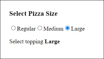
Now if you select the topping as 'Large', you should be able to see it displayed below:

