# How to style React components using CSS
You might have come across different ways to style React components.
In this article, we will discuss the most popular ways to do it and the advantages and disadvantages of using them.
## Inline Styling
If you want to add a style quickly, you can make use of the `style` prop to pass the styles to the element as shown below:
```jsx
import React from "react"
const InlineStyle = () => {
return (
Lorem ipsum, dolor sit amet consectetur adipisicing elit. Ea ab
exercitationem soluta, consequatur obcaecati suscipit numquam dolorem,
dignissimos quas nobis error repellat minus sed accusamus placeat, rerum
illum magnam aspernatur?
)
}
export default InlineStyle
```
As you could see, we have to pass the styles in a JavaScript object to the style prop.
You can see a demo of using inline styles [here](https://react-styling.vercel.app/inline-style).
### Advantages
- With inline styles, we do not want to create a separate css file and switch between the css and the component file while applying styles.
### Disadvantages
- As you may have seen in the demo, nothing happens when you hover over the button.
This is because, with inline styles, you will not be able to add pseudo selectors like `:hover`,`:focus` etc.
- This requires you to write css in the js format, which many people who are used to writing css in a traditional way may not like.
- We cannot reuse the styles, or use any selectors, which makes the code lengthy and unmaintainable.
## In-Page Styles
In Page styles are nothing but inline styles extracted to a separate JavaScript object:
```jsx
import React from "react"
const InPageStyle = () => {
return (
Lorem ipsum, dolor sit amet consectetur adipisicing elit. Ea ab
exercitationem soluta, consequatur obcaecati suscipit numquam dolorem,
dignissimos quas nobis error repellat minus sed accusamus placeat, rerum
illum magnam aspernatur?
)
}
const styles = {
button: {
backgroundColor: "#0ea5e9",
border: "none",
color: "white",
borderRadius: "0.5rem",
padding: "0.5rem 1rem",
cursor: "pointer",
},
paragraph: {
color: "green",
background: "lightGreen",
padding: "0.5rem 1rem",
},
}
export default InPageStyle
```
The advantage of using styles this way is you can reuse the styles within the component.
If you place it in a common file and export the styles, then you can use it throughout the application.
## Global styles
Global styles are the traditional way of having a css file containing all the styles related to the entire application.
To make use of global styles, create a css file called global.css as shown below:
```css
.button {
background-color: #0ea5e9;
border: none;
color: white;
border-radius: 0.5rem;
padding: 0.5rem 1rem;
cursor: pointer;
}
.button:hover {
background-color: rgb(37, 99, 235);
}
.paragraph {
color: green;
background: lightGreen;
padding: 0.5rem 1rem;
}
```
Now include the `global.css` in the topmost component in your project:
```jsx
import React from "react"
import "./global.css"
const GlobalStyle = () => {
return (
Lorem ipsum, dolor sit amet consectetur adipisicing elit. Ea ab
exercitationem soluta, consequatur obcaecati suscipit numquam dolorem,
dignissimos quas nobis error repellat minus sed accusamus placeat, rerum
illum magnam aspernatur?
)
}
export default GlobalStyle
```
### Advantages
- Unlike inline styles, we can have different types of selectors to share the styling between components.
- Since style is separated into a different file, it helps in having a cleaner code.
### Disadvantages
- Since all the styles are stored in a single css file, if multiple people are working on the project,
then it might result in both code conflict and styling conflicts.
> Create react app comes with default `index.css`, which is an example of global css styling.
You can see a demo of the global css [here](https://react-styling.vercel.app/global-style).
## CSS Modules
CSS Modules is a way to have separate css styles for each module.
Let's separate the buttons and paragraphs into different components.
```jsx
import React from "react"
import styles from "./ButtonOne.module.css" // Import css modules stylesheet as styles
const ButtonOne = () => {
return (
)
}
export default ButtonOne
```
```jsx
import React from "react"
import styles from "./ButtonTwo.module.css" // Import css modules stylesheet as styles
const ButtonTwo = () => {
return (
)
}
export default ButtonTwo
```
```jsx
import React from "react"
import styles from "./Paragraph.module.css" // Import css modules stylesheet as styles
const Paragraph = () => {
return (
Lorem ipsum, dolor sit amet consectetur adipisicing elit. Ea ab
exercitationem soluta, consequatur obcaecati suscipit numquam dolorem,
dignissimos quas nobis error repellat minus sed accusamus placeat, rerum
illum magnam aspernatur?
)
}
export default Paragraph
```
Now let's add the styles for all the 3 components:
```css
.button {
background-color: #0ea5e9;
border: none;
color: white;
border-radius: 0.5rem;
padding: 0.5rem 1rem;
cursor: pointer;
}
.button:hover {
background-color: rgb(37, 99, 235);
}
```
```css
.button {
background-color: rgb(239, 68, 68);
border: none;
color: white;
border-radius: 0.5rem;
padding: 0.5rem 1rem;
cursor: pointer;
}
.button:hover {
background-color: rgb(185, 28, 28);
}
```
```css
.paragraph {
color: green;
background: lightGreen;
padding: 0.5rem 1rem;
}
```
Finally, let's include all the components in our app:
```jsx
import React from "react"
import ButtonOne from "./ButtonOne"
import ButtonTwo from "./ButtonTwo"
import Paragraph from "./Paragraph"
const CssModules = () => {
return (
)
}
export default CssModules
```
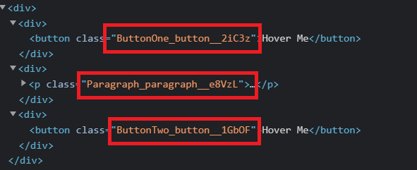
If you inspect the [demo page](http://localhost:3001/css-modules) and see, you will observe that the classes are named in the format `__`.
This is done to avoid any conflicts between the css modules.
### Advantages
- Since each module has a separate css file, multiple developers can work in parallel without css or merge conflicts.
### Disadvantages
- There can be code duplication if the same style is used across the modules (which can be solved by pushing the common styles to a global stylesheet).
So far we have seen methods supported in react by default. Now we will see some third-party libraries, which help in styling the app.
## Styled Components
[Styled Components](https://styled-components.com/) helps in defining the styles of a component by passing the actual css using template literals (back ticks), as shown below:
```jsx
const Button = styled.button`
border-radius: 3px;
padding: 0.5rem 0;
margin: 0.5rem 1rem;
width: 11rem;
background: transparent;
color: white;
border: 2px solid white;
`
```
Now we just need to include the Button component wherever it is needed.
To make use of styled components, we need to install it first (you may use `npm i styled-components` if you prefer to.):
```bash
yarn add styled-components
```
Consider the following code:
```jsx
import React from "react"
import styled, { css } from "styled-components"
const Button = styled.button`
background: transparent;
border-radius: 3px;
border: 2px solid palevioletred;
color: palevioletred;
margin: 0.5em 1em;
padding: 0.25em 1em;
cursor: pointer;
${props =>
props.primary &&
css`
background: palevioletred;
color: white;
`}
`
const Paragraph = styled.p`
color: green;
background: lightGreen;
padding: 0.5rem 1rem;
`
const StyledComponents = () => {
return (
Lorem ipsum, dolor sit amet consectetur adipisicing elit. Ea ab
exercitationem soluta, consequatur obcaecati suscipit numquam dolorem,
dignissimos quas nobis error repellat minus sed accusamus placeat, rerum
illum magnam aspernatur?
)
}
export default StyledComponents
```
Styled Component can receive props and then apply different styles if that prop matches some condition.
Like in our case, we are changing the color and the background of the button, if the prop `primary` is set to true.
A demo of the above code can be found [here](https://react-styling.vercel.app/styled-components).
We can also extend an existing style as shown below:
```jsx
const Button = styled.button`
border-radius: 3px;
padding: 0.5rem 0;
margin: 0.5rem 1rem;
width: 11rem;
background: transparent;
color: white;
border: 2px solid white;
`
const EnhancedButton = styled(Button)`
:hover {
color: red;
}
`
```
The `EnhancedButton` will get all the styles from the `Button` component and the styles defined by itself.
## Emotion
[Emotion](https://emotion.sh/docs/introduction) is alternative to styled-components.
We can install emotion in React by running the following command:
```bash
yarn add @emotion/react
```
Now we can use emotion in our app:
```jsx
/** @jsxRuntime classic */
// this comment tells babel to convert jsx to calls to a function called jsx instead of React.createElement
/** @jsx jsx */
import { css, jsx } from "@emotion/react"
const color = "white"
const Emotion = () => {
return (
Lorem ipsum, dolor sit amet consectetur adipisicing elit. Ea ab
exercitationem soluta, consequatur obcaecati suscipit numquam dolorem,
dignissimos quas nobis error repellat minus sed accusamus placeat, rerum
illum magnam aspernatur?
)
}
export default Emotion
```
If you see, it is a bit similar to styled components, which uses the backtick syntax.
In fact, there is a package called [@emotion/styled](https://www.npmjs.com/package/@emotion/styled),
which helps in writing css in styled-component way!
The demo for the above code can be found [here](https://react-styling.vercel.app/emotion).
## SASS support
If you wish to use [SCSS](https://sass-lang.com/) in your app, then you can do so by installing `node-sass`:
```bash
yarn add node-sass@4.14.1
```
Now create file named `styles.scss` with the following content:
```scss
$myColor: purple;
h2 {
color: $myColor;
}
```
Then use it in the component by importing it:
```jsx
import React from "react"
import "./styles.scss"
const Sass = () => {
return (
Styling using SASS
)
}
export default Sass
```
## Other libraries
There are other libraries as well like [tailwind](https://tailwindcss.com/), and component libraries like [Semantic UI](https://react.semantic-ui.com/), [React Bootstrap](https://react-bootstrap.github.io/), [Ant Design](https://ant.design/), [Chakra UI](https://chakra-ui.com/), [BluePrint](https://blueprintjs.com/), [Material UI](https://mui.com/), etc., which you can try out.
## Source code and Demo
You can view the complete [source code here](https://github.com/collegewap/react-styling) and a [demo here](https://react-styling.vercel.app/).